
Let’s start with the basics: what is a landing page? A landing page is a page designed specifically for lead conversion. Your landing page is customised to promote a specific offer: you direct visitors there so that they can take the desired action.
You may be wondering why a landing page is necessary - why does each offer need its own customised page?
If someone is tempted by your offer you don’t want to send them to your homepage, where they could get distracted by all the other material you have. You want to make conversion as easy and likely to happen as possible. A landing page contains lead forms where your visitors submit their information, in order to receive your offer. Everything else on the landing page is focused towards getting your visitor to accept this offer, fill out the form and become a new lead. Because your landing page has a sole objective - lead conversion - it is navigation free so there are no distractions to prevent your lead from converting.
How do landing pages fit into the conversion process?
Lead conversion is the process by which you turn visitors into leads. It’s the first step in creating a relationship with your potential customer. So what role does a landing page play here? Let’s take a look at the lead conversion timeline:
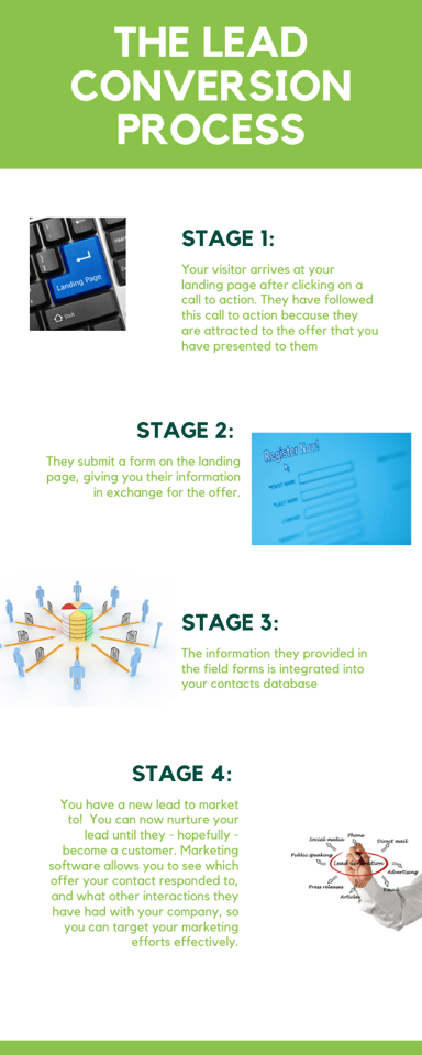
As you can see, lead conversions take place on the landing page itself.
Why is your landing page so important?
You have already invested time researching your buyer persona, and coming up with attractive offers to appeal to your buyer persona wherever they are in their buyers journey. The landing page is the moment of truth - your visitors have signalled interest in your offer if they have landed there - but a landing page needs to be optimally designed to actually achieve lead conversion. People are wary of giving up personal information, or making commitments: the job of your landing page is to combat this reluctance.
Landing page best practices
Every landing page is different but there are certain best practices to follow to maximise your landing pages success rate
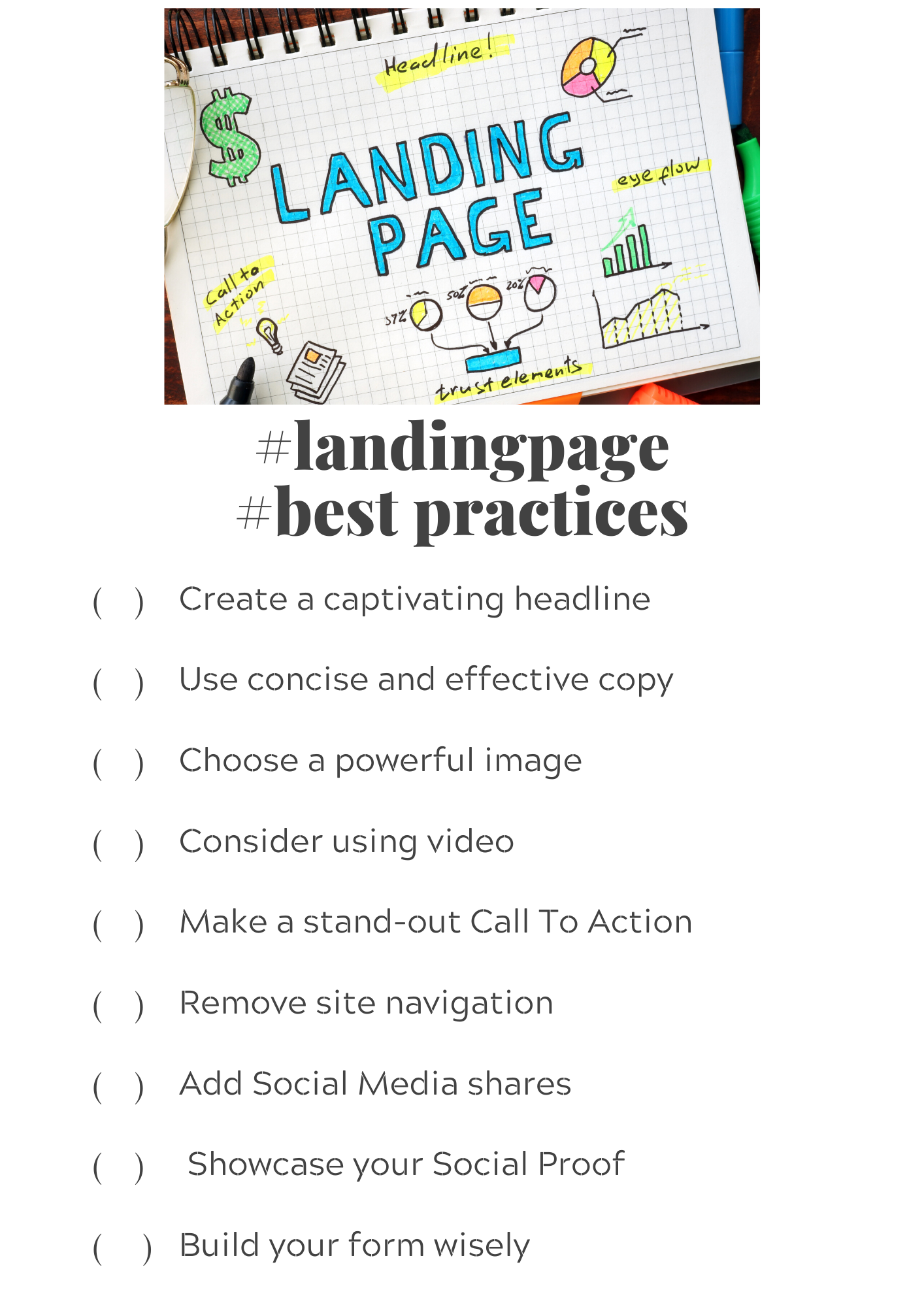
Let’s take a deeper look at these best practices
- Create a captivating headline
Your headline should grab your visitors attention and be prominently displayed. According to Hubspot, at least 7/10 of your landing page visitors will bounce off the page: Your headline is the first thing your visitors will see - and you only have seconds to make an impact and get visitors to stay!
Your headline is critical for even the visitors that are sticking around. Ted Vrountas at Instapage cites David Ogilvy’s assertion that 8 out of 10 people only read the headline! Your headline needs to clearly communicate what benefit your visitor will receive and how valuable your offer is.
- Your copy must be effective, concise and easily understood
You don’t have long to make your case to your visitor, so your copy needs to get your message across quickly. Jennifer Shore at Smartbug recommends getting your copy to satisfy a blink test. A blink test means you have 3-5 seconds to convey your message to your reader - ie. before they blink. Test your copy out on other people and see how it fares.
Here are some tips for crafting compelling copy:
- Use bullet points. They are engaging and quick to digest. Numerical data, statistics and short quotes work well with this format
- Use user-friendly, relevant language that is easy to understand. Unless your buyer persona is extremely well-educated, this is not the time to throw industry jargon around. You want your reader to immediately connect with what you are offering.
- Consumer-centric language will get your visitors attention faster. Use “you” terminology to relay the benefits your visitor will receive.
- Mirror the language you used to attract your visitor to your landing page: this creates a seamless transition for your visitor.
- FOMO is real. Any phrases that imply scarcity such as “time-limited offer”, “offer ends tomorrow”, “last few places available” will encourage your visitor to take advantage of your offer.
- Consider adding impressive statistics and case studies of how this offer has benefited people that are similar to your visitor.
- Don’t forget to optimise your copy for search engines. Include your target keywords so that your landing page will show up on organic and paid searches.
- Utilise click triggers: A click trigger is the copy positioned next to where your visitor is supposed to convert, designed specifically to give your visitor that final encouraging push. Reminding them that they can unsubscribe easily, stating your privacy policy or a quote from a satisfied customer can all serve as click triggers. Try to identify the most significant reason your visitor would have not to convert - and show them why they don’t need to worry.
- Use a powerful image to impart value
Images break up the monotony of text and can convey a message much faster than words. Your hero shot - the image that is the leading visual representation of your offer - is critical so don’t cut corners by choosing a generic stock image.
Your image needs to be relevant, engaging and ‘match’ your buyer persona. Your image is a great opportunity to show off the value of your offer - it can help your visitor understand what they will be getting or how they will be feeling when they receive your offer. For example, if you are advertising a service that saves time, your image could include a person looking relaxed, or like they have new found super powers!
- Consider using video
Video is a great tool to consider, as it is engaging and easy for visitors to digest. Video is particularly valuable if your product is more complex. You can use video as the primary element of your landing page and include some text underneath. Incorporating a video into landing pages has shown to boost conversion rates by 80%
- Your call to action (CTA) should stand out
Your CTA should stand out with bold colours and be prominently displayed. Use short, actionable words to convey benefit to your visitor. Be clear about what they need to do.
- Remove site navigation
Remember the only goal of your landing page is to get visitors to convert so you don’t want them getting distracted! Any other links - even internal links to other enticing information on your website - are competition for your visitor’s attention. Removing site navigation keeps your visitor focused on the conversion opportunity at hand.
- Add social media shares
You may have removed site navigation but you don’t want to miss an opportunity to promote your offer! Add social media shares but ensure they clicking on them opens a new tab so your visitor doesn’t end up leaving the page
- Social proof
Social proof taps into marketing psychology which claims that people are more likely to trust your business if their peers or trusted authorities do. Positive testimonials, awards, endorsements from high-profile business users and statistics that show that your products popularity all constitute social proof. Because it’s a landing page designed to promote conversion on a specific offer, try to keep your social proof focused, for example, instead of a generic positive review for your company, post a review from a customer about how capitalising on your offer has helped them.
- Build your form wisely
In an ideal world, your visitor would be happy to divulge endless amounts of useful information on your form. In reality, your landing page is transactional - the value your visitor perceives your offer as having will determine how much information they are willing to part with. You want to create a low barrier to entry so only ask for the information that you really need.
Think about who your offer was designed for, and what stage in the buyers journey your visitor is likely to be at. If they are at an early stage, keep the number of fields on your form to a minimum. Identifying your visitors stage in the buyers journey will also guide you as to what form fields to consider. It will probably suffice to collect a name and contact details for an awareness stage visitor. For a more interested and engaged visitor at the consideration stage, it will be helpful for you to gather more substantive information to use for further marketing interactions.
You can use software to optimise your form. Alex Birkett considers Formisimo to be the most robust in the industry at providing form analytics. It tracks and reports on various metrics such as field drop off, problem fields and completion time, and offers tips on how to improve your form.
Tips for a well-designed landing page
Even once you have incorporated all the best practices mentioned above, you still need to pay attention to the design and layout of your landing page. A chaotic, unattractive design will be off-putting to visitors, whereas an appealing, thought-out design promotes lead conversion.
Check out the streamlined look of this landing page:
.png?width=1286&name=Screenshot%20(58).png)
What design tips should you be paying attention to?
- Check you have included all the key components
The most basic landing page needs a headline, image, lead form, call-to-action and some accompanying copy. You can add other elements, but make sure you keep it sufficiently simple so that you don’t overwhelm your key components.
- Keep it above the fold
Your visitors need to see the most crucial elements of your landing page without needing to scroll down. Your headline, image and form should definitely feature in this prominent space: the first ⅓ of the screen. While you hope that your visitor will scroll down, they need to be intrigued enough to do so, and clear enough about what page they have landed on first.
- Don’t neglect the area below the fold
Neil Patel recommends placing CTAS at regular intervals throughout your landing page. If your landing page is longer and visitors have scrolled down, you want to keep their experience simple and user-friendly too.
- Consistent design
Francis Santos suggests making sure that there is consistent design, colour and use of motifs throughout the visitor’s journey, so they don’t think they have stumbled onto the wrong page. You want the experience to be seamless. Consistent design also reinforces your branding.
- Utilise white space
While you may be excited to showcase every way your offer can add value to your customer, consider the overall effect of your landing page. Too much information detracts from the most important messages you want to share. Careful use of white space stops your visitor feeling bombarded.
- Make your CTA eye-catching
Your design should be consistent with your branding efforts, but your CTA shouldn’t blend in. Use bold colours, preferably that complement the other colours you have featured.
- Draw attention to your form
It needs to stand out and - of course - it should be obvious that your visitor needs to fill it out to take advantage of your offer
- Proofread your landing page
You don’t want your visitors' eyes to be instantly drawn to sloppy spelling or an annoying grammatical mistake. Don’t forget to edit your masterpiece!
- Your landing page needs to be responsive to every viewing experience
Only half of landing pages are optimised for mobile devices, despite the fact most web traffic comes from mobile devices. Check that your landing page, and especially your form, work well on mobiles and tablets too.
Testing your landing page
Now that you have designed your landing page, it’s time to check whether it’s performing optimally. Sometimes, making minor adjustments could make a big difference.
The first place to start is with A/B testing. Instead of manually changing one element at a time, a/b testing allows you to try out different versions of your landing page on different visitors. That way you can tell which version performs better. Choose one aspect of your landing page to tweak each time so you know which element requires attention. There is infinite scope for a/b testing but start with the areas that we have already defined as being most impactful. See if changing your headline, image or colours makes a difference. Play around with your copy and the wording of your click-triggers. And don’t forget the form itself! See whether changing the fields or the length of the form affects your conversion rate.
Once you have launched your landing page, you’ll want to see how it’s measuring up. Checking these key metrics will tell you how your landing page is performing, and will highlight which areas need improvement:
- Submission rate: The number of people that successfully fill out your form and land on your thank you page
- New contacts created: This may differ from your submission rate as if some forms are filled out by existing leads they won’t be included in this count.
- Form abandonment: This is the number of people who start filling out your form but don’t complete it. If this number is high it may mean that you are asking for too much information, relative to the value your visitor thinks they will derive from your offer. Maybe the form is too long, or the fields are too complicated or unclear.
- Bounce rate: Visitors that leave your landing page immediately. If this is high, it suggests that your copy isn’t convincing visitors to redeem that offer, or that the landing page wasn’t what they were expecting.
When you analyse your landing page, it’s important to see how it compares to similar landing pages in your industry. Knowing the norms for your industry enables you to set reasonable expectations for your landing page, and provides important context when analysing your metrics. Internal comparisons can also be helpful. If you have other landing pages that are performing better, try to identify why those are successful and apply those winning techniques!
While it’s important to test and analyse, remember that daily traffic and conversions won’t give you actionable data - you need a longer period to identify patterns and trends.
You’ve created a great landing page: What next?
Promote it!
Now that you have created a fabulous landing page, make sure that your potential leads can find it! Place CTAs on website pages and blog posts that have material that correlates with your offer, so that interested visitors can be directed to your landing page. You can also promote your landing page through an email campaign. Use segmented lists to target the leads that would be most interested in your offer. Similarly, promote your offer on social. Focus on the platforms where your buyer personas are most likely to be.
Think about post conversion marketing
Your landing page was designed to convert leads so it’s easy to think your job is done once your visitor has successfully filled out the form. But you can build on this success! Post conversion marketing uses the momentum of a successful first conversion to request a second, on the confirmation page. Add links to other relevant offers that might appeal to your new leads, on the your confirmation page itself.
Say thank you!
Send your lead to a new thank you page once they have filled out the form. This page might be where they can access their offer, for example, where they receive their free download. A thank you note - as well as being polite - shows your lead that you value their interest. You can also use this page to promote other suitable offers, invite them to subscribe to your blog, or ask them to follow you on social.
Follow up with an automated email
This could be a day or a week later, but don’t miss the chance to nurture your lead. You can ask them whether they enjoyed their download, or direct them to other offers you have that may interest them. Anyone who was on your thank you page should automatically receive this email.
Concluding thoughts
Landing pages are prime opportunities for lead conversion. Once you have incorporated the best practices for your landing page and implemented the design tips you should definitely be on the right track. You can test and tweak so many components of your landing page so keep experimenting until you find the landing page version that performs best.
Leave us
a Comment!